
Abstract
Spatio-temporal travelling waves are striking manifestations of predator–prey and host–parasite dynamics. However, few systems are well enough documented both to detect repeated waves and to explain their interaction with spatio-temporal variations in population structure and demography. Here, we demonstrate recurrent epidemic travelling waves in an exhaustive spatio-temporal data set for measles in England and Wales. We use wavelet phase analysis, which allows for dynamical non-stationarity—a complication in interpreting spatio-temporal patterns in these and many other ecological time series. In the pre-vaccination era, conspicuous hierarchical waves of infection moved regionally from large cities to small towns; the introduction of measles vaccination restricted but did not eliminate this hierarchical contagion. A mechanistic stochastic model suggests a dynamical explanation for the waves—spread via infective ‘sparks’ from large ‘core’ cities to smaller ‘satellite’ towns. Thus, the spatial hierarchy of host population structure is a prerequisite for these infection waves.
Main
Travelling waves, arising essentially from activator–inhibitor dynamics1,2,3, are predicted by theory in a range of host–natural enemy systems1,4,5,6,7,8. However, except as the product of invasion dynamics9, empirical observations of waves are comparatively rare—especially repeated periodic waves associated with host–natural enemy population cycles7,8,10,11,12. Even where waves are dynamically possible, they may not be detected because of a lack of spatio-temporal data at the appropriate resolution. More subtly, spatial heterogeneities in population density or demography8,13 and temporal changes in parameters (resulting, for example, from vaccination against disease1,6), can significantly alter the detection and dynamics of spatio-temporal waves. The integration of models and data to explore these interactions between spatial dynamics and host demography is often prevented by a lack of demographic information.
Childhood microparasitic infections—in particular, historical measles epidemics in developed countries—provide sufficiently detailed spatio-temporal data on disease incidence and host demography14,15 to address these issues. The task is aided by epidemiological models16,17,18,19,20,21, which capture both the nonlinear dynamics of childhood epidemics as a function of local population size16 and the impact of significant environmental forcing. This forcing mainly comprises seasonality in transmission, due to schooling patterns17, and longer-term variations in susceptible recruitment, due to birth-rate variations and the onset of vaccination20,22. Such long-term temporal changes in dynamic rates give rise to non-stationarity in the resulting ecological time series.
The detection of temporal and spatio-temporal oscillations in time series is greatly complicated by non-stationary temporal variations in dynamical behaviour (such as changes in mean, variance, period of oscillations, and so on). In particular, trends or sudden jumps in cycle period complicate the search for temporal and spatial patterns, since conventional frequency-domain analyses assume stationarity23,24. Figure 1a illustrates the periodic but non-stationary dynamics of weekly measles notifications for London for the period 1944–94. There are marked changes in epidemic period between the 1940s and 1950s, as well as into the vaccine era (after 1968).

a, The time series. b, Local wavelet power spectrum (LWPS); power is colour coded as shown on the key at top right. c, Global wavelet spectrum. d, Summary of temporal changes in the dominant epidemic period, averaged across towns and cities in England and Wales. e, Shape of the Morlet wavelet used in the analysis.
We apply wavelet time series analysis23,24,25,26 to describe the non-stationarity in the period of recurrent epidemics of measles in England and Wales. Wavelet phase angles also reveal rapid spatio-temporal waves of infection, originating from regional centres. Finally we use a refined epidemiological model to suggest how such waves can arise in seasonal environments, and explore the role of spatial heterogeneities in creating them.
Local measles dynamics
Measles epidemics in developed countries generally exhibit seasonal cycles and longer-term (generally biennial) major epidemics18,19,27. However, the relative importance of the seasonal versus multiannual cycles varies with time. These features of the dynamics are clearly seen from a wavelet spectral analysis of the time series of weekly measles notifications for London from 1944 to 1994 (Box 1 and Fig. 1). The local wavelet power spectrum (Fig. 1b) shows the importance of the different oscillatory periods as a function of time. The seasonal cycles and (in general) biennial major epidemics are obvious, as also is the long-term non-stationarity in the period of the major epidemic. The main long-term change in dynamics accompanies the onset of vaccination in 1968 (Fig. 1b). After this, the annual periodicity is less marked and the intervening major epidemics (now of lower amplitude) gradually increase in period, compared to the pre-vaccine era. This gradual transition coincides with a steady increase in vaccine uptake from around 50% in the 1970s to around 90% in the late 80s (Fig. 1d). Theory predicts18,20, and previous time-series analyses have confirmed20,28, that vaccination should generate an increase in the epidemic period. Here we use the temporal dimension of the wavelet analysis to reveal the progressive nature of this increase (Fig. 1b).
To generate a synoptic picture of transitions in measles dynamics across 354 administrative areas of England and Wales (see Methods), we focus on changes through time in the dominant epidemic period (Fig. 1d). The regional pattern is remarkably consistent with the detailed analysis for London: biennial epidemics before widespread vaccination are followed by epidemics of longer period through the vaccine era. A second important feature of the pre-vaccination era is the reduction in inter-epidemic interval (to under 2 years) coinciding with the 1945–47 and 1962–65 ‘baby booms’22. All these transitions in disease dynamics are driven by ‘extrinsic’ variations in recruitment rate of susceptibles20 (Fig. 1d) through changes in birth rates (discounted by vaccine uptake in the vaccination era). The analysis includes hundreds of locations, ranging from large cities (where there are regular epidemics) to small towns (where disease dynamics are strongly influenced by stochasticity27). Consequently, these results give an unusually detailed picture of the influence of changes in host demography on epidemic dynamics.
Travelling waves and wavelet phase angles
We investigate spatio-temporal patterns by calculating the phase difference between epidemics at different locations. For cycles with a given period, the wavelet analysis generates a phase angle at each time step (Methods)23. This contrasts with standard multivariate spectral analysis, which can capture phase relationships at different periods29, but does not allow a description of how they change with time. Because the raw phase spectrum is defined at each time step and period, it is difficult to interpret directly. We therefore focus on the phase of the relatively well defined (generally biennial) major epidemics, using wavelet reconstruction23 (see Methods). We investigate the wavelet phases for periods between 1.5 and 3 years, using the wavelet reconstruction to calculate the average cycle and associated phase across these periods at each time step. This procedure allows naturally for observed spatio-temporal variations in major epidemic period and phase (Box 1).
The phase analysis is well illustrated by the pre-vaccination records for Norwich and Cambridge, because epidemics in these relatively close cities (90 km apart) were out of phase during the 1950s (ref. 30, Fig. 2). We also include results for London for comparison. The raw series (Fig. 2a) shows that major epidemics in Cambridge were aligned with London (and the national pattern) and occurred in odd years (1951, 1953, 1955, and so on). Norwich, by contrast, had epidemics that peaked in even years for the 15 years following World War Two. Figure 2c shows the major epidemic pattern for the three cities as revealed by the wavelet reconstruction. This confirms that the main epidemic period in London was predominantly biennial from around 1950; before that, epidemics tended to be more annual (Fig. 1a, b). More dramatically, the analysis highlights the early phase difference between Cambridge and Norwich (Fig. 2c–e), followed by the change in Norwich's epidemic phase from odd to even years in the late 1950s (we return below to the cause of Norwich's unusual even-year major epidemic timing). The analysis indicates that the biennial cycles of Cambridge and Norwich were 100 to 160° (7–11 months) out of phase for 16 years (Fig. 2e), after which they locked more closely into phase. Figure 2e also shows that major epidemics in Cambridge lagged several weeks behind those in London.

a, Pattern of weekly case reports. b, Logarithmic values of number of cases reported: log[x + 1]. c, Major epidemic (mainly biennial) component of the three series, reconstructed from wavelet spectral analysis (Box 1); the series were reconstructed from components in the period range 1.5 to 3 years, to allow for a flexible period (‘multiannual’ is probably therefore a better term than biennial, though the predominant variation is over 2 years). d, Average phase angles of the reconstructions in c. e, Phase difference between Cambridge and the other two cities, based on the phase angles in d; to remove spurious ‘jumps in phase difference, the raw phase difference (θ) is constrained within ±180°, by the transformation: mod(θ + 540,360) - 180, where mod(x,y) is x modulo y.
We observe from Fig. 2 that the phase difference between major epidemics changes relatively smoothly through time. This advances our objective of interpreting the complex spatio-temporal pattern of measles epidemics in terms of the spatial pattern of phase differences. For instance, phase-locked fluctuations (for example, refs 7 and 3) should result in zero phase-difference across the map, whereas travelling waves1,4,5 should generate a phase difference that increases with distance.
We focus first on the 1950–66 period—after the 1947 baby boom but before vaccination—when the 2-year epidemic cycle was particularly pronounced (Fig. 1a). Figure 3a maps the average phase difference relative to London for the whole urban pre-vaccination data set (954 locations). Most, though not all, places lag behind London (88% have negative phase difference). Concentrating on the London region (Fig. 3c), there is a clear wave of infection moving away from the capital city. The wave is particularly well defined up to 30 km from London (Fig. 3c) with a wave speed of around 5 km per week. Figure 3d reveals the existence of a similar wave around Manchester. (We note that the focus of this wave is less well defined because there are several large cities—such as Leeds and Liverpool—that feed into the epidemic dynamics of North-western England.) The measles waves are illustrated dynamically in the Supplementary Information: the movie shows the raw incidence and phase analysis for the whole of England and Wales across seven epidemic cycles.

a, Urban mean phase differences from London for the pre-vaccination (1950–66) data, based on wavelet spectra (see Methods). Phases are coded by colour and angle as shown on the circular legend (see the Supplementary Information for more details). London is represented by a square. b, Phase differences from London of rural districts between London and Norwich; colour coding is as in a. c, Mean urban phase difference from London for 1950–66 in the London region, as a function of distance from the capital city. Within 30 km of London, there is a significant correlation of phase difference and distance (r = -0.59, 99% bootstrap limits: -0.75 to -0.39); the error bars are 99% bootstrapped confidence limits. d, As c, but showing phase difference from London in the Manchester area.
The time-averaged phase map (Fig. 3a) highlights the hierarchical nature of the waves, which move from large population centres to the surrounding hinterland throughout the 1950s and 60s. During this era, several hierarchical waves have their foci in large cities and spread progressively to more distant small towns (see also ref. 14). The dominant waves are those associated with London (Fig. 3c) and the northwestern industrial centre (Fig. 3d), but the hierarchical spread of infection is a consistent feature of the phase map, as is reflected in its spatial correlation structure (Fig. 4a, b; see below). An interesting feature of the pattern is that, although London—the biggest city—leads the epidemics in surrounding areas (Fig. 3a, c), the major epidemic appears on average 4–6 weeks before London in the urban northwest (Fig. 3a, d), moving from Liverpool and Manchester into the north Midlands. We speculate that this may arise from the unusual annual dynamics of Liverpool (which are due to high local birth rates30), effectively ‘subsidizing’ the growth of the epidemic in Manchester and Leeds and thereby sparking off early hierarchical waves in this region. Such regional heterogeneities are likely to be an interesting line of inquiry in future work. A second notable feature is the distinct pattern during the 1950s of even-year epidemics in the cities and villages of East Anglia, centred on Norwich (Fig. 3a, b). We speculate on the origin of this pattern in Box 2.

Spatial phase coherency function (a) and spatial synchrony of measles cases (b) with 95% confidence limits (see Methods). The horizontal bars represent the grand average phase coherence and grand average synchrony split into the pre-vaccination and vaccination eras. c, Phase difference from London as a function of population size for towns within 30 km of the capital (compare with Fig. 3c). Partial correlation analysis shows that phase difference is significantly and independently related both to distance from London (r = -0.5, P < 0.001; Fig. 3c) and population size (r = 0.46, P < 0.0001).
To quantify the geographic extent of the epidemic waves, we use spatial phase coherency functions (PCF)—calculated as the (non-parametric) spatial correlation function7 of the major epidemic phases (Fig. 4a; see Methods). These functions express the correlation in phase angles at different locations as a function of intervening distance. During the pre-vaccination era, phases in nearby locations are generally found to be highly correlated. The correlation declines with distance to a distinct minimum at around 250 km, which possibly crudely reflects the spatial extent of the two dominant hierarchical waves. The PCF reveals that the local phase coherence was significantly higher than the regional average to a distance of around 100 km (Fig. 4a). In the vaccine era (Fig. 4a), the PCF resembles the pre-vaccination function in shape, but the average coherence is consistently and significantly lower. The extent of significant local phase coherence dropped to around 75 km during the 1970s. Extensions of the phase analysis (not shown) indicate that the hierarchical waves moving from large centres persist through the 1980s. However, the spatial extent of the waves dropped further (local coherence is only significant to 35 km), as high vaccination rates induced irregular epidemics later in the vaccine era32.
Phase coherence effectively measures the relative timing of epidemics. A complementary approach is to consider the synchrony7 of the epidemic time series (see Methods), which also reflects how their relative amplitudes covary. The pattern of synchrony in measles (Fig. 4b) follows the qualitative pattern of the phase coherency: declining with distance and with a lower mean in the vaccine era. However, the synchrony of epidemics is significantly less than their phase coherence, especially in the vaccine era. This indicates that vaccination induces stronger variations in the amplitude of epidemics than in their relative phase. Previous studies32,33,34 have documented reductions in synchrony of measles epidemics as a result of vaccination. The present analysis reveals the detailed architecture of the change (Fig. 4b).


A ‘forced forest fire’ model for measles waves
The measles waves depart from the assumptions of classical theoretical models predicting travelling waves in two important ways. First, local transmission is strongly seasonally forced; second, the spatial distribution of the host is inherently very heterogeneous. We focus on the relatively simple spatial hierarchy surrounding London in the pre-vaccination era (Figs 3c and 4c), in order to understand the essence of the epidemic waves. In this region, the wave moves fairly uniformly away from London (Fig. 3c). However, there is evidence that, in addition to distance, the local population size is important—smaller centres lag more than larger ones (Fig. 4c). Further analysis shows that both distance from London and population size contribute significantly to the epidemic lag (Fig. 4 legend).
This set of observations prompts the following conceptual model for the generation of travelling waves in childhood epidemics. Consider two epidemiologically coupled towns, with biennial measles cycles that are roughly in phase (for example, see Fig. 5a). Assume further that one town is large—above the critical community size (CCS) for measles persistence of around 300,000 (ref. 35)—and that the other town is below the CCS: (1) After a large epidemic, susceptible densities build up to the deterministic threshold, above which another epidemic can happen18. (2) In the large town, measles is endemic throughout the inter-epidemic trough, so that a new epidemic occurs as soon as the effective reproductive ratio of infection exceeds unity18; this threshold is determined by the accumulation of susceptible children, modified by seasonally varying transmission rates associated with the school year. (3) By contrast, in the small town, infection goes extinct locally after an epidemic; therefore, another epidemic cannot happen until an infective ‘spark’ is received, generally originating in a larger (endemic) community.

a, Coupling relatively small peripheral population units (below the critical community size, CCS, for measles persistence) to a central ‘city’. b, Coupling larger populations (each above the CCS) to the city. c, As in a, but extending the size of the linear array of populations.
This reasoning prompts the following hypotheses: (1) The spatial mosaic of large and small places is responsible for the lag in epidemics—we propose that having a group of small towns surrounding a large conurbation generates the hierarchical epidemic waves. (2) As a corollary, coupling large centres (all above the CCS) should generate highly synchronized epidemics (as a result of nonlinear phase locking of seasonally forced oscillators)31. (3) Finally, weakly coupled or distant centres should have a stronger tendency than nearer towns to move onto the ‘opposite’ biennial attractor from the main conurbation.
We tested these conjectures using a mechanistic model for the spread of measles across a linear array of locally coupled sites (Box 2). The model generates a picture in tight agreement with our conceptual scenario. First, if we couple a central large city to an array of outlying towns below the CCS, we observe a spatio-temporal wave of infection. Epidemics in the outlying towns lag progressively behind those in the city (Fig. 5a). Note that dividing the city into tightly coupled ‘boroughs’ does not generate a lag within the large centre. Second, if we repeat the analysis by coupling a series of large communities all above the CCS, the result is near-perfect coherence, with no evidence of epidemic waves (Fig. 5b). Because epidemics do not suffer local extinction, and because all the cities experience the same seasonal forcing, no lags are generated. Thus, the observed travelling waves are best seen as repeated and very fast invasion waves, extending from endemic core areas into epidemic satellite regions.
Third, we examine the effects of relative epidemiological isolation by extending the array of distant, more loosely coupled communities (Fig. 5c). As before, synchronized major epidemics with superimposed spatio-temporal waves appear for small communities close to the large one. However, epidemics in more distant towns can drop onto the opposite biennial attractor. This is preliminary evidence that relative isolation may be a source of the unusual ‘even year’ behaviour of pre-vaccination measles epidemics in Norwich and its environs (Fig. 2), during parts of the pre-vaccination era.
Our study raises a number of issues. We illustrate how wavelets can be used for analysing both non-stationary time series and spatio-temporal patterns in ecology and population biology. Spatial and temporal non-stationarity is the norm in ecology. It may be caused by a number of factors, including anthropogenic influences and biological evolution, as well as more esoteric dynamical effects, such as coexisting attractors20,36 and intermittent periodicity in chaos37. Wavelets are emerging as essential tools in the study of intermittent processes in the physical sciences and experimental biology26. Here we have illustrated a basic application of wavelet analysis in population dynamics, complementing previous applications to spatial transect patterns38; there should be significant scope for further careful ecological application of wavelets. The wavelet phase analysis also provides an unusual method for analysing ecological travelling waves. Although other statistical models have been successfully developed11,39, wavelet phase angles are naturally suited to allowing for variations in cycle period and amplitude.
In addition, the non-stationarity that we demonstrate in the measles series is due mainly to variations in the recruitment of susceptible individuals, driven by birth rates and especially by the onset of vaccination22,32. Mass immunization caused a dramatic fall in susceptible recruitment rates and a marked reduction in the spatial correlation and coherence of epidemics: this may have important consequences for the design of vaccination programmes19,32. The implications of hierarchical (‘core–satellite’) epidemic dynamics for the control of established and emergent diseases are important areas for future research.
Finally, our analysis demonstrates prominent repeated spatio-temporal waves, superimposed on the well-known epidemic time series of measles in England and Wales. This echoes, on a more extensive spatio-temporal scale, seminal work on the hierarchical spatial diffusion of measles epidemics14. The simplicity of the measles dynamical ‘clockwork’ and the intricacy of the human demographic record allow us this unusual opportunity to quantify the impact of spatio-temporal heterogeneities on epidemic dynamics. The clearest temporal transition is the effect of mass vaccination. On a shorter timescale, seasonal variation in infection rate is a major driver of the dynamics40,41. Classical reaction–diffusion models of host–natural enemy systems often predict recurring travelling waves in homogeneous (non-hierarchical) systems1. However, such waves are precluded for measles, because of the strongly synchronizing effect of seasonally forced transmission31. Previous theory31,33,42 indicates that seasonally driven epidemics will either be completely synchronized across large coupled centres or more irregular in small centres buffeted by demographic noise.
This prediction is at odds with the observed waves (Figs 3 and 4), leading us to propose a different underlying mechanism—measles waves arise as repeated invasions from endemic core areas to the periphery. The coupling of large and small centres may thus be the critical feature that generates waves in these seasonally forced systems. This mechanism has analogies with the operation of the ‘rescue effect’ in core–satellite metapopulations43 and also with forest fire dynamics44. Forest-fire-like epidemic dynamics have previously been explored in the irregular, epidemic measles outbreaks observed on isolated small islands45. This work provides evidence of such phenomena in an endemic epidemiological context.
Methods
The data
We use weekly official measles notifications and associated demographic data for England and Wales15,19,46. For the pre-vaccination era, before 1966, weekly measles case data are available for 945 cities and towns and 457 rural districts; these data sets are the basis of the pre-vaccination wavelet analysis (Figs 2, 3a, b and 4c). In 1974, boundary changes agglomerated the spatial data into 354 administrative areas. To achieve consistent time series across both pre-vaccination and vaccine era, we have therefore binned the pre-vaccination data into the post-1974 boundaries (Figs 1 and 4a, b).
Wavelet time series analysis
See Box 1. All series are logarithm transformed (after adding a constant of one) to make them more sinusoidal, and subsequently scaled to zero mean and unit variance. Assume that we have a time series, In, n = 0,…,T - 1 (for consistency, n is used as the time index throughout the paper). We analyse temporal changes in the distribution of power at different scales s (approximately periods) using a Morlet wavelet function, ψ0(η) = π-1/4 exp(iω0η) exp(-η2/2), where ω0 is the non-dimensional frequency here taken to be 6 (ref. 23) and η = n/s. The Morlet wavelet, ψ0, is a damped complex exponential (Box 1).
The continuous wavelet transform (CWT), Wn(s), of the time series In(n = 0,1,2…) is calculated as the convolution of In with a scaled and translated version of ψ0 (ref. 23). For the Morlet wavelet, scale is approximately equal to the Fourier period, so that the lowest scale, s0, roughly corresponds to the maximum (Nyquist) frequency of 0.5 cycles per time step. The local wavelet power spectrum (Box 1), at time point n and scale s is then given by |Wn(s)|2.
To minimize biases due to edge effects, the data were padded with zeros, up to the next-highest power of two23. The ‘cone of influence’ (the parabola in Fig. 1b) is a reflection of a consequent loss in statistical power near the start and end of the series; the area below the parabola in Fig. 1b should be interpreted cautiously. The width of the cone also gives a rough lower limit for how wide a feature needs to be at a given scale for it to represent genuine cyclical behaviour, rather than a spike. We conduct significance tests using methods described and discussed in ref. 23.
To isolate the major biennial epidemics for the phase analysis, we use wavelet reconstruction23 to partition the original series, in terms of the contribution of variation at different frequencies.
Phase relationships between time series
A wavelet transform based on a complex wavelet, such as the Morlet wavelet, has a phase angle, defined by

where Re[Wn(s)] is the real, and Im[Wn(s)] the imaginary part of Wn(s). In practice, we use this formula to calculate the time series of phase angles (θn) associated with the wavelet transform of the reconstructed major epidemic cycle for each time series. These can be used as absolute phases (Fig. 2d) or phase differences (Fig. 2e); phases and phase differences are restricted to the range ±180° (see Fig. 2, legend).
Algorithms
The algorithms and notation used here are based on a practical guide to meteorological wavelet analysis23. See also http://paos.colorado.edu/research/wavelets/ for more background information. The website also includes a set of wavelet algorithms in Matlab, on which the analyses shown here are based.
Phase coherency and correlation functions
We calculate the phase coherency, ϑi,j, between two cities, i and j, by considering the correlation between the time series of phase angles, θi,n and θj,n:

where θ̄ represents the respective mean phases, and σ the respective standard deviation of the phases. We further define the phase coherency function, η(d), which governs how the phase coherency relates to the distance, d, separating any two cities. Assuming that the phase coherency forms a stationary random field, then the phase coherency function (PCF) represents the spatial correlation function of that field. We estimate the PCF, without making a priori assumptions about the functional form, by using the nonparametric covariance function (NCF)7,47,48. The NCF uses either a kernel function or (as in our case) a cubic B-spline to estimate the underlying correlation function. We use a smoothing spline with 25 equivalent degrees of freedom (e.d.f.), and quantify the confidence envelopes for the functions using 500 bootstrap iterations (see ref. 48 for details of estimation and testing).
We measure epidemic synchrony between two populations as the Pearson correlation coefficient between the two variance-stabilized (square-root transformed) time series of incidence. We calculate the spatial correlation functions governing how this synchrony depends on distance—again, using the nonparametric spline covariance function. Separate phase coherency and spatial correlation functions are calculated for the pre-vaccination (1954–64) and vaccination (1970–80) data, based on the 354 time series that span both eras.
The spatial TSIR model
We used the following parameters for the model in Box 2: α = 0.97, and {βn} is an annually periodic function with the following values for the 26 biweeks of the year: 1.11 × 10⁻⁵, 1.11 × 10⁻⁵, 1.10 × 10⁻⁵, 1.09 × 10⁻⁵, 1.06 × 10⁻⁵, 1.03 × 10⁻⁵, 1.01 × 10⁻⁵, 9.84 × 10⁻⁶, 9.63 × 10⁻⁶, 9.40 × 10⁻⁶, 9.10 × 10⁻⁶, 8.71 × 10⁻⁶, 8.29 × 10⁻⁶, 7.89 × 10⁻⁶, 7.60 × 10⁻⁶, 7.49 × 10⁻⁶, 7.60 × 10⁻⁶, 7.93 × 10⁻⁶, 8.42 × 10⁻⁶, 8.95 × 10⁻⁶, 9.43 × 10⁻⁶, 9.80 × 10⁻⁶, 1.01 × 10⁻⁵, 1.03 × 10⁻⁵, 1.05 × 10⁻⁵, 1.08 × 10⁻⁵. These values are a smoothed version of the estimated parameters for the London time series49. The biweekly birth rate, B, is set at 100 for small population units (Fig. 5a) and 2,000 for large ones (Fig. 5b).
References
Murray, J. D. Mathematical Biology (Springer, London, 1989).
Neubert, M. G., Kot, M. & Lewis, M. A. Dispersal and pattern formation in a discrete-time predator–prey model. Theor. Pop. Biol. 48, 7–43 (1995).
Sherratt, J. A. Periodic travelling waves in cyclic predator–prey systems. Ecol. Lett. 4, 30–37 (2001).
Hassell, M. P., Comins, H. N. & May, R. M. Spatial structure and chaos in insect population dynamics. Nature 353, 255–258 (1991).
Sole, R. V., Valls, J. & Bascompte, J. Spiral waves, chaos and multiple attractors in lattice models of interacting populations. Phys. Lett. A 166, 123–128 (1992).
Jeltsch, F., Muller, M. S., Grimm, V., Wissel, C. & Brandl, R. Pattern formation triggered by rare events: Lessons from the spread of rabies. Proc. R. Soc. Lond. B 264, 495–503 (1997).
Bjørnstad, O. N., Ims, R. A. & Lambin, X. Spatial population dynamics: analysing patterns and processes of population synchrony. Trends Ecol. Evol. 14, 427–432 (1999).
Blasius, B., Huppert, A. & Stone, L. Complex dynamics and phase synchronization in spatially extended ecological systems. Nature 399, 354–359 (1999).
Mollison, D. Modeling biological invasions—chance, explanation, prediction. Phil. Trans. R. Soc. Lond. B 314, 675–693 (1986).
Bulmer, M. G. A statistical analysis of the 10-year cycle in Canada. J. Anim. Ecol. 43, 701–718 (1974).
Lambin, X., Elston, D. A., Petty, S. J. & MacKinnon, J. L. Spatial asynchrony and periodic travelling waves in cyclic populations of field voles. Proc. R. Soc. Lond. B 265, 1491–1496 (1998).
Ranta, E. & Kaitala, V. Travelling waves in vole population dynamics. Nature 390, 456–456 (1997).
Stenseth, N. C. et al. Common dynamic structure of Canada lynx populations within three climatic regions. Science 285, 1071–1073 (1999).
Cliff, A. D., Haggett, P. & Smallman-Raynor, M. Measles: An Historical Geography of a Major Human Viral Disease from Global Expansion to Local Retreat, 1840–1990 (Blackwell, Oxford, 1993).
Grenfell, B. T. & Bolker, B. M. Cities and villages: infection hierarchies in a measles metapopulation. Ecol. Lett. 1, 63–70 (1998).
Bartlett, M. S. in Proc. Third Berkeley Symp. on Mathematical Statistics and Probability Vol. 4, 81–109 (Univ. California Press, Berkeley, 1956).
Schenzle, D. An age-structured model of pre- and post-vaccination measles transmission. IMA J. Math. Appl. Med. Biol. 1, 169–191 (1984).
Anderson, R. M. & May, R. M. Infectious Diseases of Humans: Dynamics and Control (Oxford Univ. Press, Oxford, 1991).
Grenfell, B. T. & Harwood, J. (Meta)population dynamics of infectious diseases. Trends Ecol. Evol. 12, 395–399 (1997).
Earn, D. J. D., Rohani, P., Bolker, B. M. & Grenfell, B. T. A simple model for complex dynamical transitions in epidemics. Science 287, 667–670 (2000).
Finkenstädt, B. F. & Grenfell, B. T. Time series modelling of childhood diseases: a dynamical systems approach. J. R. Stat. Soc. C 49, 187–205 (2000).
Grenfell, B. T., Bjornstad, O. N. & Finkenstädt, B. F. Dynamics of measles epidemics. II. Scaling noise, determinism and predictability with the time series SIR model. Ecol. Monogr. (in the press).
Torrence, C. & Compo, G. P. A practical guide to wavelet analysis. Bull. Am. Meteorol. Soc. 79, 61–78 (1998).
Nason, G. P. & von Sachs, R. Wavelets in time series analysis. Phil. Trans. R. Soc. Lond. A 357, 2511–2526 (1999).
Daubechies, I. Ten Lectures on Wavelets (Society for Industrial and Applied Mathematics, Philadelphia, 1992).
Percival, D. B. & Walden, A. T. Wavelet Methods for Time Series Analysis (Cambridge Univ. Press, Cambridge, 2000).
Bartlett, M. S. Measles periodicity and community size. J. R. Stat. Soc. A 120, 48–70 (1957).
Anderson, R. M., Grenfell, B. T. & May, R. M. Oscillatory fluctuations in the incidence of infectious disease and the impact of vaccination: time series analysis. J. Hyg. 93, 587–608 (1984).
Chatfield, C. The Analysis of Time Series: An Introduction (Chapman and Hall, London, 1996).
Finkenstädt, B. F. & Grenfell, B. T. Empirical determinants of measles metapopulation dynamics in England and Wales. Proc. R. Soc. Lond. B 265, 211–220 (1998).
Lloyd, A. L. & May, R. M. Spatial heterogeneity in epidemic models. J. Theor. Biol. 179, 1–11 (1996).
Earn, D., Rohani, P. & Grenfell, B. T. Spatial dynamics and persistence in ecology and epidemiology. Proc. R. Soc. Lond. B 265, 7–10 (1998).
Bolker, B. M. & Grenfell, B. T. Impact of vaccination on the spatial correlation and dynamics of measles epidemics. Proc. Natl Acad. Sci. USA 93, 12648–12653 (1996).
Cliff, A. D., Haggett, P., Stroup, D. F. & Cheney, E. The changing geographical coherence of measles morbidity in the United States, 1962–88. Stat. Med. 11, 1409–1424 (1992).
Bartless, M. S. The critical community size for measles in the U.S. J. R. Stat. Soc. A 123, 37–44 (1960).
Grenfell, B. T., Bolker, B. M. & Kleczkowski, A. Seasonality and extinction in chaotic metapopulations. Proc. R. Soc. Lond. B 259, 97–103 (1995).
Kendall, B. E., Schaffer, W. M. & Tidd, C. W. Transient periodicity in chaos. Phys. Lett. A 177, 13–20 (1993).
Bradshaw, G. A. & Spies, T. A. Characterizing canopy gap structure in forests using wavelet analysis. J. Ecol. 80, 205–215 (1992).
Bjørnstad, O. N. & Bascompte, J. Synchrony and second order spatial correlation in host-parasitoid systems. J. Anim. Ecol. 70, 924–933 (2001).
Schaffer, W. M. & Kot, M. Nearly one dimensional dynamics in an epidemic. J. Theor. Biol. 112, 403–427 (1985).
Schwartz, I. B. in Biomedical Modelling and Simulation (eds Eisenfeld, J. & Levine, D. S.) 201–204 (Scientific, New York, 1989).
Bolker, B. M. & Grenfell, B. T. Space, persistence and the dynamics of measles epidemics. Phil. Trans. R. Soc. Lond. B 348, 309–320 (1995).
Hanski, I. & Gyllenberg, M. Two general metapopulation models and the core-satellite hypothesis. Am. Nat. 142, 17–41 (1993).
Bak, P. How Nature Works—The Science of Organised Criticality (Oxford Univ. Press, Oxford, 1977).
Rhodes, C. J. & Anderson, R. M. Power laws governing epidemics in isolated populations. Nature 381, 600–602 (1996).
Office of Population Censuses and Surveys Registrar General's Weekly Return for England and Wales (Her Majesty's Stationery Office (HMSO), London, 1944–94).
Hall, P. & Patil, P. Properties of nonparametric estimators of autocovariance for stationary random fields. Prob. Theor. Relat. Fields 99, 399–424 (1994).
Bjørnstad, O. N. & Falck, W. Nonparametric spatial covariance functions: estimation and testing. Environ. Ecol. Stat. 8, 53–70 (2001).
Bjørnstad, O. N., Finkenstädt, B. & Grenfell, B. T. Dynamics of measles epidemics. I. Estimating scaling of transmission rates using a time series SIR model. Ecol. Monogr. (in the press).
May, R. M. & Anderson, R. M. Spatial heterogeneity and the design of immunization programs. Math. Biosci. 72, 83–111 (1984).
Acknowledgements
We thank S. Cornell, T. Coulson, J. Gog, M. Keeling, A. Lloyd, G. Nason, P. Rohani, C. Torrence and C. Williams for helpful discussions. B.T.G. and J.K. were supported by the Wellcome Trust. O.N.B. was supported by the National Center for Ecological Analysis and Synthesis (a Centre funded by an NSF grant, the University of California Santa Barbara, and the State of California) and the Norwegian Science Foundation.
Author information
Authors and Affiliations
Corresponding author
Supplementary information

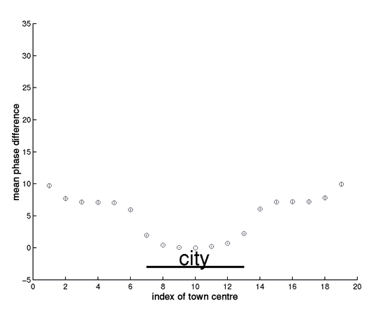
Figure I
(GIF 9.32 KB)
The figure (which accompanies Box 2, figure a) shows the mean (+/s.e.) biennial wavelet phase of 60 simulations of the spatial TSIR model with small centres, defined in Box 2 of the paper. To explore the phase relationships arising from approximately phase-locked biennial cycles, the simulations were run for 10 years, starting from the phase-locked deterministic attractor of the system.
Notes
-
1.
The phase lag is not an ‘edge’ effect, since wrapped boundary condition also generate a phase lag near the city.
-
2.
As we move away from the city, note that the phase error bars widen. This is partly due to greater irregularity nearer the edge, but also partly because occasional simulations drop onto the opposite attractor (with 180o phase lag). As noted in Box 2, this partly reflects distance from the city, but also a genuine edge effect (note that Norwich and its environs are near the coast, hence an ‘edge’ in terms of measles transmission).
-
3.
Previous work (Bjørnstad et al. 2001, op. cit.) shows that the relative measles transmission rate (Ro) in the England and Wales data set is constant across 3 orders of magnitude of population size. In fact, the crude models used here show slight increases in transmission rate with coupling (because tight coupling in the crude way we have defined it can increase Ro).
This is illustrated in Figure (II), which presents a phase analysis of the case when large centres are coupled (cf Box 2, figure (b) in the paper). Increased coupling between boroughs increases their effective Ro and causes them to lead the ‘periphery’ slightly, by 1 time step (2 weeks) – note also that the phase analysis picks up this small phase lag more sensitively than the crude plot of average biennia in Box 2.
This effect – which is a byproduct of our coupling model, cannot cause the progressive phase lag of the periphery seen in Figure (I); this latter is driven by ‘sparks’ of infection in the hierarchical system, as described in Box 2. However, the effect of coupling on effective transmission does complicate the analysis of the relationship between waves and coupling. We are currently exploring this issue: preliminary analyses indicate that hierarchical waves will occur at a range of ‘intermediate coupling rates, as long as the overall dynamics are biennial and major epidemics occur in the same year. Recent work (1) indicates that a more mechanistic representation of coupling can remove the spurious slight increase in R0 in tightly-coupled centres.
(1) Keeling, M.J. & Rohani, P. (2001) Spatial Coupling in Epidemiology: A Mechanistic Approach. Ecol. Letts. (in press).

Structure of the movie frame
The movie shows the dynamics of measles in England and Wales during the period 1955-1965. The data are from the Registrar General's weekly notifications of measles in 954 urban locations; the movie plots a frame every 2 weeks.
The upper left quadrant shows observed measles dynamics, using colour coding for the logarithm of the number of reported infected cases (all data are scaled on (0-1) before plotting). Zero case reports are shown as white circles and circle size is proportional to {population size}0.2. The movie captures the overall synchonised biennial 'pulse' of measles epidemics, superimposed on the seasonal swing of infection. There are also more irregular epidemics in smaller places and many other interesting patterns, for example distinctive behaviour in many coastal towns.
The observed data also show travelling waves of measles, moving away from large centres such as London. These are revealed more clearly in the upper right quadrant, which shows the smoothed major epidemic cycles, filtered using wavelets in a window of 1.75 to 3 years. As discussed in the paper, the filtered series reveal dramatic waves of measles, moving away from large centres, especially London and the North West conurbation. The lower left quadrant shows the phase difference from London of these filtered series (see the paper for more details). The arrows and the colour of the arrows are indicators of the phase difference, as shown on the circular key (green denotes a zero phase difference from London, blue denotes a lag and yellow a lead). These give a more stable picture of the phase relationships -- notably, the wave moving away from London and a relatively early wave from the North West. Finally, the lower right quadrant plots a moving time bar against the London and Manchester series.
Running the movie after download
The format of the movie is flic, because it allows for high compression of the data. You can watch the movie in a variety of players - for example, Quicktime or the freeware Autodesk player AAwin.
Click here to download the Quicktime plugin >>> http://www.apple.com/quicktime/download/
Rights and permissions
About this article
Cite this article
Grenfell, B., Bjørnstad, O. & Kappey, J. Travelling waves and spatial hierarchies in measles epidemics. Nature 414, 716–723 (2001). https://doi.org/10.1038/414716a
Received:
Accepted:
Published:
Issue Date:
DOI: https://doi.org/10.1038/414716a
This article is cited by
-
Anticipating epidemic transitions in metapopulations with multivariate spectral similarity
Nonlinear Dynamics (2023)
-
North to south gradient and local waves of influenza in Chile
Scientific Reports (2022)
-
Sars-Cov2 world pandemic recurrent waves controlled by variants evolution and vaccination campaign
Scientific Reports (2022)
-
Urban Scaling of Health Outcomes: a Scoping Review
Journal of Urban Health (2022)
Comments
By submitting a comment you agree to abide by our Terms and Community Guidelines. If you find something abusive or that does not comply with our terms or guidelines please flag it as inappropriate.
