Abstract
Genomic experiments produce multiple views of biological systems, among them are DNA sequence and copy number variation, and mRNA and protein abundance. Understanding these systems needs integrated bioinformatic analysis. Public databases such as Ensembl provide relationships and mappings between the relevant sets of probe and target molecules. However, the relationships can be biologically complex and the content of the databases is dynamic. We demonstrate how to use the computational environment R to integrate and jointly analyze experimental datasets, employing BioMart web services to provide the molecule mappings. We also discuss typical problems that are encountered in making gene-to-transcript–to-protein mappings. The approach provides a flexible, programmable and reproducible basis for state-of-the-art bioinformatic data integration.
Introduction
As it becomes possible to investigate biological systems in ever more detail with respect to different aspects, such as DNA sequence variation and copy number, epigenetic modifications of DNA and chromatin, RNA expression and protein abundance, and the interaction of proteins with nucleic acids and metabolites, it becomes necessary to analyze the data in an integrative manner. Researchers then need to address two main challenges: first, each technology needs specific preprocessing, error modeling, normalization and statistical data analysis methods; second, and typically for good scientific reasons, a variety of systems of identifiers and coordinate systems are used for the DNA, RNA and protein molecules targeted in these experiments, for the probing reagents (such as DNA probes on microarrays or siRNAs). Identifiers are also needed for the annotation of genomes, genes and gene products in public databases with information regarding, for instance, sequences, gene ontology, assignment to pathways, known interactions and associations with diseases and other phenotypes.
The open source programming environment R1 provides mathematical, statistical and graphical facilities that are used in many different fields of science for data analysis or development of new analysis methods. The Bioconductor Project2 is an open source and open development software project geared towards the development of tools for the analysis of genomic datasets. It consists of a variety of R packages and interfaces to other software systems, each tackling specific bioinformatic data manipulation and analysis needs. R and Bioconductor together provide a comprehensive and powerful set of tools to address the first challenge mentioned above. Furthermore, they provide data structures for the different types of experimental data that can be flexibly manipulated, combined and mined for relationships.
How to address the second challenge: constructing proper transformations between different identifier systems and obtaining the needed annotations? Public bioinformatics service providers, such as NCBI (National Center for Biotechnology Information), EBI (European Bioinformatics Institute) and UCSC (University California Santa Cruz), as well as many instrument and reagent vendors, have websites on which users can look up relevant information. However, manual lookup does not perform well for genome-scale experiments. Typically, these websites therefore also provide files with bulk annotation and mappings. Traditionally, a bioinformatician would download these files, parse them, subset the relevant information and load it into appropriate data structures in their program. However, this process is tedious, error-prone, needs to be repeated each time a new version of such files is released, and does not provide assistance with dealing with contradictory information.
The query oriented data management system and web service BioMart3, developed by the Ontario Institute for Cancer Research and the European Bioinformatics Institute (Hinxton, UK), provides access to mappings, relationships and annotation from several biological databases such as Ensembl4 and Wormbase5. Besides genome annotation databases, several other biological databases are served through the BioMart system. For example, Reactome6 is a knowledgebase of human biological pathways and processes. The Bioconductor package biomaRt7,8 provides an Application Programming Interface (API) to BioMart web services and enables the programmable construction and subsequent analysis of large and complex queries to BioMart services from R. It allows the seamless embedding of identifier matching and annotation in statistical data analysis procedures. We have been using it in many of our data analysis projects9,10, and it is widely used by others (e.g., it is currently the most frequently used client platform for accessing the Ensembl BioMart web services).
The strength of the biomaRt package in querying online web services can also be a limitation: internet access is needed, performance of repeated queries can be slower than with the bulk download paradigm, and 'freezing' the results at a particular version of the underlying databases needs additional attention and is not always easy. For some of the tasks, the precompiled Bioconductor annotation packages11 offer an excellent alternative; however, their thematic scope is more limited.
The vast majority of human gene loci are annotated consistently in different databases. For these loci, one can start from an Ensembl Gene identifier, get a single and unique corresponding Entrez Gene identifier and in many cases a HGNC (HUGO Gene Nomenclature) symbol, and the reverse mapping from Entrez Gene to Ensembl is equivalently unambiguous. However, there is a smaller, but appreciable set of cases that are more complicated. This is because of the differences in annotation methodology or in the data underlying the annotation. The three groups, NCBI12, Ensembl and HGNC13, are actively working on reconciling differences in annotation along with other groups. Many of these cases reflect unusual biological complexity. Here, the current goal of genome annotators is to provide further qualifiers, so that, at the very least, a user can know when instances reflect real complexity rather than only seeing a tangle of relationships and wondering whether there was a database error.
A case in point is the PROTOCADHERIN GAMMA (PCDHG) gene locus. A query in Ensembl version 52 for the gene symbol PCDHGA12 results in four Entrez Gene identifiers: 5098, 26025, 56097 and 56098. The locus has one Ensembl Gene identifier (ENSG00000081853) and four Ensembl transcript identifiers. At NCBI, however, each of the four Entrez Gene identifiers is mapped to a different HGNC symbol, PCDHGC3, PCDHGA12, PCDHGC5 and PCDHGC4, respectively. This gene locus is part of the protocadherin-γ gene cluster, which, like some other loci in the human genome such as the Ig locus, has a complex organization and cannot be easily fitted in the canonical view of a gene. In this cluster, 22 variable region exons are followed by a constant region of three exons shared by all genes in the cluster. The protocadherin community argued that the best representation of this biology mapped to the gene locus concept was for separate HGNC names for different transcripts. However, considering the agreed single locus nature of this region with a limited number of transcripts and related functions, a single locus with multiple transcripts (as represented in Ensembl) is more consistent for many genomic interpretations of data in this region. For such complex loci there will never be a clear set of criteria that one can apply in a consistent manner and that can satisfy all users of the information. Rather, the best scenario is a careful flagging with a qualifier, thus alerting the end user of the information that special consideration of a complex biological scenario may be needed.
As genome annotation is still work in progress, data and analysis results published a few years ago have to be treated with caution. Microarray data, for instance, are prone to probe-to-gene mapping changes because of improved genome annotations, often making it difficult to map published results from the past to the present. Updated probe to genome annotation mappings are provided by array manufacturers and by databases such as Ensembl, and alternatively one can compute one's own alignments. Integrating data from different experiments, using different sets of probes, is often biologically complex, and the choice on how to do this should depend on context and judgement. As long as our understanding of biology improves, such mappings will remain dynamic, and hence, it is important that genome annotation resources are updated regularly and that these updates can find an easy way to enter into bespoke algorithms and software for the data analysis tasks. The BioMart data warehouses and the biomaRt R/Bioconductor interface are powerful and effective tools for doing so.
To ensure the scientific value and effect of such analyses, we recommend that publications quote the version number of any database used and that software scripts are provided in supplemental information for complete clarity and reproducibility of the analysis.
Materials
Equipment setup
R/Bioconductor
-
The current release of R can be downloaded.
The needed add-on packages can be installed from Bioconductor by starting R and giving the following instructions to the R interpreter: source('http://www.bioconductor.org/biocLite.R') biocLite(c('biomaRt','affy','gplots','lattice'))
Data
-
As an example of how to use this protocol, in the procedure we use data produced from a panel of 51 breast cell lines14. The dataset consists of mRNA expression measurements, array comparative genomic hybridization (CGH) measurements of DNA copy number and protein quantifications from western blots. mRNA expression was measured using the Affymetrix U133a platform, and the CEL files are available at the ArrayExpress database15 with the accession number E-TABM-157. The arrayCGH data and protein quantification data can be downloaded as Excel files. A ZIP archive with all data files is provided in Supplementary Data 1 (E-TABM-157.zip). Unpack it on the computer and set R's working directory to the location of the files.
setwd('C:/Documents and Settings/MyUserID/MyData')
This protocol can be adapted to other datasets with a similar experimental design; all intermediate results should be carefully checked. For datasets that use different array technologies or additional types of assays, the adaptation will need further effort.
biomaRt
-
The following commands load the biomaRt package and open an editor window, in which a file with the programme code for this protocol can be viewed. We recommend that readers use this file to reproduce the analysis shown here.
library('biomaRt') NP2009code()
Procedure
-
1
Load the needed add-on packages.
library('affy') library('gplots') library('lattice')
-
2
The tabulator-delimited text file E-TABM-157.txt has one row for each microarray and three columns such as: Array.Data.File contains the names of the raw (CEL) data files; Source.Name contains the name of the cell line from which the cDNA was extracted; and CancerType indicates the type of breast cancer that the cell line represents (basal A, basal B or luminal, according to table 1 in reference 14). Import the sample annotation into R using the read.AnnotatedDataFrame function and import the CEL files using the following ReadAffy function:
sampleAnnot = read.AnnotatedDataFrame('E-TABM-157.txt', row.names = 'Array.Data.File') mRNAraw = ReadAffy(phenoData = sampleAnnot, sampleNames = sampleAnnot$Source.Name)
-
3
Normalize the Affymetrix data using RMA16.
mRNA = rma(mRNAraw)
-
4
To undertake principal component analysis using the mRNA profiles of the 200 most variable probesets (see Fig. 1), first compute the variance of all probesets; the apply function applies the var function to compute the variance to each row of the expression matrix. The order of the variances from high to low is computed using the order function, and the indices of the top 200 probesets are stored in the vector ord. Next, carry out a principal component analysis using these top 200 probesets. To do this, the matrix needs to be transposed by the t function to meet the format expect by the prcomp function, which computes the principal component decomposition. Finally, plot the samples according to the first two principal components (pca$x[, 1:2]), which represent the largest and second largest variance components in the data. Color the samples by sample type using the colors specified in the typeColors vector. From this plot, we can learn that the mRNA expression profiles cluster the samples according to cancer type:
Figure 1: Principal component analysis using the mRNA profiles of the 200 most variable probesets. 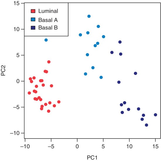
It should be noted how the first principal component (PC1) clearly separates the luminal type (red) from the basal A (light blue) and basal B (dark blue) types, between which the variation is more continuous.
probesetvar = apply(exprs(mRNA), 1, var) ord = order(probesetvar, decreasing=TRUE)[1:200] pca = prcomp(t(exprs(mRNA)[ord,]), scale=TRUE) typeColors = c('Lu'='firebrick1','BaA'='dodgerblue2','BaB'='darkblue') plot(pca$x[, 1:2], pch=16, col=typeColors[as.character(mRNA$CancerType)], xlab='PC1', ylab='PC2', asp=1) legend('topleft', c('luminal', 'basal A', 'basal B'), fill=typeColors)
-
5
Read the (already normalized) CGH data from the aCGH.csv file. Create an object cgh of class ExpressionSet, which is Bioconductor's standard container for microarray-like data. The intensity data matrix is filled with columns 4–56 of the data file, whereas columns 1–3 provide metadata for the microarray probes:
cghData = read.csv('aCGH.csv', header=TRUE, row.names=1) cgh = new('ExpressionSet', exprs = as.matrix(cghData[,4:56])) featureData(cgh) = as(cghData[,1:3], 'AnnotatedDataFrame')
-
6
Plot the arrayCGH data of chromosome 1 for three cell lines; extract the indices of the corresponding probes into the chr1 vector using the which function. Next, use the indices in chr1 to select the log-ratio values for these probes and the three cell lines, and store them in the vector logRatio. The chr1 indices are also used to select the chromosomal positions of these probes; as we need them for each of the three samples, repeat them three times using the rep function before storing them in the vector kb. The vector clName contains the cell line name for each element in the logRatio vector. Pass these values to the xyplot function, whose result is shown in Figure 2:
Figure 2: The CGH log-ratios of chromosome I for three cell lines (MCF10A, BT549 and BT483). 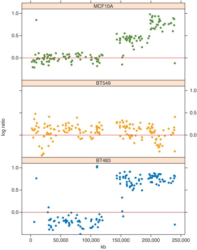
Chromosomal coordinates vary along the x-axis. It is to be noted how MCF10A and BT483 have amplifications on the q-arm of the chromosome, which is the right-hand half of the plot as the region with no values in the middle of each plot is the centromere.
chr1 = which(featureData(cgh)$Chrom == 1) clColors = c('MCF10A' = 'dodgerblue3', 'BT483' = 'orange', 'BT549' = 'olivedrab') logRatio = exprs(cgh)[chr1, names(clColors)] kb = rep(featureData(cgh)$kb[chr1], times=ncol(logRatio)) clName = rep(names(clColors), each=nrow(logRatio))
print(xyplot( logRatio ∼ kb | clName, pch=16, layout=c(1,3), ylim=c(-0.5, 1.1), panel=function(...){ panel.xyplot(...,col=clColors[panel.number()]) panel.abline(h=0, col='firebrick2') }))
-
7
Determine the genomic coordinates for the genes on chromosome 1 probed by the mRNA expression data of Steps 2–4; establish a connection with the Ensembl BioMart web service using the useMart function, and select the dataset by setting the dataset argument to hsapiens_gene_ensembl. getBM is the main query function of biomaRt. In BioMart systems, attributes specify the features we wish to retrieve from the database, whereas the set of records to be selected is defined by the filters and values arguments; comprehensive documentation of the biomaRt software can be found in the vignette that comes with the package.
ensembl = useMart('ensembl', dataset='hsapiens_gene_ensembl') probes = getBM(attributes = c('affy_hg_u133a', start_position'), filters = c('chromosome_name', 'with_affy_hg_u133a'), values = list(1, TRUE), mart = ensembl)
-
8
Extract the expression values for BT483 and BT549 and make a scatterplot (see Fig. 3) that distinguishes, by point color, between probes in- and outside the region amplified in BT483:
Figure 3: Expression data of probes mapping to chromosome 1 for the two cell lines BT483 and BT549. 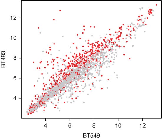
The probesets mapping to the region amplified in BT483 (genomic coordinate >140 MB) are shown by red dots, the other probesets in gray. The expression difference is significant with a t-test P-value of 2.2e-16.
xpr = exprs(mRNA)[probes[,'affy_hg_u133a'], c('BT549','BT483')] pos = probes[,'start_position'] plot(xpr, pch=16, cex=0.5, col=ifelse(pos>140e6, 'red', 'darkgrey'))
-
9
t-test whether the log-ratios between BT483 and BT549 are systematically different between the amplified and unamplified regions. It should be noted that console text preceeded by '#' is the printed output of the t.test function:
logRatios = xpr[,2] - xpr[,1] t.test(logRatios ∼ (pos>140e6))
# Welch Two Sample t-test
# data: logRatios by pos > 1.4e+08
# t = -14.1299, df = 2044.034, p-value < 2.2e-16
# alternative hypothesis: true difference in means is not equal to 0
# 95 percent confidence interval:
# -0.6179031 -0.4672868
# sample estimates:
# mean in group FALSE mean in group TRUE
# -0.2036218 0.3389731
-
10
Read the protein quantification data from the mmc6.csv file. Analogous to Step 5, we create an object protein of class ExpressionSet:
proteinData = read.csv('mmc6.csv', header=TRUE, row.names=1) protein = new('ExpressionSet', exprs = as.matrix(proteinData))
-
11
Determine each protein's maximum expression value; we will use this to scale the colors in the heatmap (see Fig. 4). The apply function applies the max function to each row of the protein abundance matrix. In the call to the barplot function, set the las argument to 2 so that the axis labels are drawn perpendicular to the axis. From the barplot we can learn that a wide variation in expression values exists between the different proteins and that scaling of the expression matrix will improve visualization of the heatmap in Step 12:
Figure 4 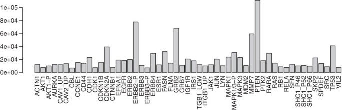
Barplot showing the maximum protein expression levels over all cell lines for each of the quantified proteins.
prmax = apply(exprs(protein), 1, max) barplot(prmax, las=2)
-
12
Compute a hierachical clustering of protein quantification data and display in a heatmap (see Fig. 5). Create a gradient from white to dark blue using the colorRampPalette function. The sideColors vector assigns a color to each sample according to its cancer type. This information can be added to the heatmap as a color sidebar for the columns by using the ColSideColors argument. The heatmap function first carries outs a hierachical clustering of the data and then plots a heatmap of a matrix with correspondingly re-ordered rows and columns. In this function the trace argument is set to none so no trace line is drawn in the heatmap. It is evident from the heatmap that the protein expression data clusters samples broadly according to cancer type:
Figure 5: Heatmap showing a hierarchical clustering of the proteins (down right-hand side) and samples (along the bottom) based on the protein expression measurements. 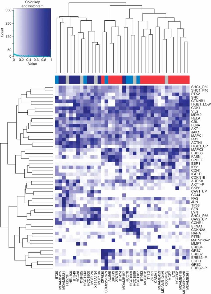
A color sidebar for the samples indicates to which cancer type the cell line belongs: basal A (blue), basal B (dark blue), luminal (red) and unknown (gray). The inset key shows on the x-axis the color scale of the protein expression matrix, from white (normalized expression value of 0) to dark blue (normalized expression value of 1). On the y-axis is the histogram count of number of points in the heatmap that have the corresponding normalized protein expression value as indicated by the light blue line.
hmColors = colorRampPalette (c('white', 'darkblue'))(256) sideColors = typeColors[as.character(pData(mRNA)[ sampleNames(protein), 'CancerType'])] sideColors[is.na(sideColors)] = 'grey' heatmap.2(exprs(protein)/prmax, col=hmColors, trace='none', ColSideColors = sideColors)
-
13
Select samples common to mRNA, cgh and protein datasets:
samples = intersect(sampleNames(protein), sampleNames(mRNA)) samples = intersect(samples, sampleNames(cgh)) mRNA = mRNA[,samples] protein = protein[,samples] cgh = cgh[,samples]
-
14
Map between HGNC symbols, by which the protein antibodies were annotated, to Ensembl gene and Affymetrix U133a identifiers. It is to be noted that console text preceded by '#' is the printed output:
map = getBM(attributes = c('ensembl_gene_id', 'affy_hg_u133a', 'hgnc_symbol'), filters = c('hgnc_symbol', 'with_hgnc', 'with_affy_hg_u133a'), values = list(featureNames(protein), TRUE, TRUE), mart = ensembl) head(map)
# ensembl_gene_id affy_hg_u133a hgnc_symbol
# 1 ENSG00000177885 215075_s_at GRB2
# 2 ENSG00000169047 204686_at IRS1
# 3 ENSG00000178568 206794_at ERBB4
# 4 ENSG00000178568 214053_at ERBB4
# 5 ENSG00000091831 211234_x_at ESR1
# 6 ENSG00000091831 211233_x_at ESR1
-
15
Determine the multiplicity of the mapping. Ideally, there would be exactly one perfectly specific and sensitive probeset for each target gene. Owing to alternative splicing, gene overlap and families of genes with similar sequence, this can be a difficult objective, and the array manufacturer has in many cases provided several probesets per gene, targeting different regions and varying in their sequence specificity. To explore this, the following table gives the number of times that the same gene is targeted by 1, 2, ... probesets. Note that console text preceded by '#' is the printed output:
geneProbesetsAll = split(map$affy_hg_u133a, map$hgnc_symbol) table(listLen(geneProbesetsAll))
# 1 2 3 4 5 6
# 13 12 8 3 1 2
-
16
Determine an mRNA expression profile for each HGNC symbol. If there are multiple probesets for the same gene, we take here the simplistic approach to prefer the probesets with the extension _at, and among these, to take the average signal:
geneProbesets = lapply(geneProbesetsAll, function(x) { good = grep('[0-9]._at', x) if (length(good)>0) x[good] else x }) summaries = lapply(geneProbesets, function(i) { colMeans(exprs(mRNA)[i,,drop=FALSE]) }) summarized_mRNA = do.call(rbind, summaries)
-
17
Plot mRNA expression and protein levels of the AURKA gene over all samples (see Fig. 6):
Figure 6: Expression profiles of AURKA over the cell lines (along the x-axis) for mRNA (orange) and protein (green) levels. 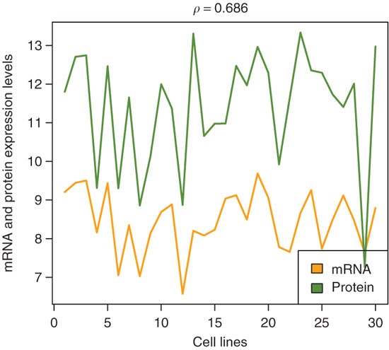
The correlation coefficient (ρ) between these profiles is 0.686.
colors = c('orange','olivedrab') correlation = cor(summarized_mRNA['AURKA',], exprs(protein)['AURKA',], method='spearman') matplot(cbind( summarized_mRNA['AURKA', ], log2(exprs(protein)['AURKA', ])), type='l', col=colors, lwd=2, lty=1, ylab='mRNA and protein expression levels', xlab='cell lines', main=bquote(rho==.(round(correlation, 3)))) legend('bottomright', c('mRNA','protein'), fill=colors)
-
18
Plot mRNA expression versus protein expression levels for all genes, in four cell lines (see Fig. 7):
Figure 7: Scatterplots of protein expression levels versus mRNA expression levels in four cell lines. 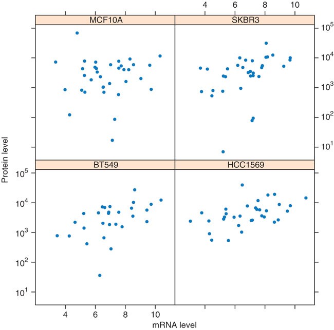
It is to be noted that there is only a modest correlation between these two methods of gene expression measurements. Differences may be due to technical reasons, as well as to regulation of mRNA translation.
samples = sampleNames(protein)[c(5,11,16,24)] v_mRNA = as.vector(summarized_mRNA[,samples]) v_protein = as.vector(exprs(protein)[ rownames(summarized_mRNA), samples]) xyplot( v_protein ∼ v_mRNA | rep(samples, each = nrow (summarized_mRNA)), pch=16, xlab = 'mRNA level', scales=list(y=list(log=TRUE)), ylab='protein level')
-
19
Use the sessionInfo() function to record the versions of R and Bioconductor packages. It is to be noted that console text preceded by '#' is the printed output:
sessionInfo()
# R version 2.9.0 (2009-04-17) # powerpc-apple-darwin8.11.1
# locale: #C
#attached base packages: #[1] grid stats graphics grDevices utils datasets methods base
# other attached packages: # [1] lattice_0.17-22 gplots_2.7.0 caTools_1.9 bitops_1.0-4.1 gdata_2.4.2 ## [6] gtools_2.5.0-1 affy_1.22.0 Biobase_2.4.1 biomaRt_2.0.0
# loaded via a namespace (and not attached): # [1] RCurl_0.94-1 XML_2.3-0 affyio_1.12.0 # [4] preprocessCore_1.6.0 tools_2.9.0
-
20
Use the listMarts function to record the version of the Ensembl database used in the analysis. It should be noted that console text preceded by '#' is the printed output:
listMarts()[1:3,] # biomart version # 1 ensembl ENSEMBL 53 GENES (SANGER UK) # 2 snp ENSEMBL 53 VARIATION (SANGER UK) # 3 vega VEGA 34 (SANGER UK)


Troubleshooting
-
1
biomaRt needs the libcurl system library, which on some Linux and OS X systems is not installed by default; it can be obtained from public package repositories or from http://curl.haxx.se. On Windows, installation of libcurl is not necessary as the RCurl package for Windows includes this library.
-
2
Normalization using RMA will need the Chip Definition File (CDF) to be accessible. This CDF file comes as an R package and will be automatically downloaded from Bioconductor by the rma function when needed.
-
3
Bioconductor has an active user community, and problems or questions related to Bioconductor packages can be posted on the Bioconductor mailing list, through http://www.bioconductor.org/docs/mailList.html. It is recommended to follow the posting guide. This protocol provides a guideline and when the user encounters problems, we refer to the Bioconductor mailing list for help.
Timing
The protocol described above should take less than 1 h to walk through. When used with data other than the example dataset, this protocol might take substantially more time, as additional adaptations to the code might be needed.
Anticipated results
We use software from the R and Bioconductor projects to process and integrate data from different biological experiments and use the biomaRt package to retrieve annotation information and identifier cross-references from Ensembl. Starting from Affymetrix CEL files, we use the normalization methods implemented in the affy package to obtain normalized expression data. We applied a principal component analysis to determine if the mRNA levels divide the breast cell line samples into different subclasses (Fig. 1). We then imported array CGH data obtained from the same set of cell lines and visualized an amplification on the q-arm of MCF10A and BT483 (Fig. 2). We showed that the mRNA levels correlate with the amplifications measured by arrayCGH (Fig. 3): there is a shift to higher expression levels for genes located in the amplified region. We then added protein quantification data from the same set of samples to this integration exercise. Figures 6 and 7 show that for a subset of genes the mRNA and protein quantification data correlate well; however, overall this correlation is modest. The main focus of this protocol is to show the seamless combination of statistical data analysis and bioinformatic annotation retrieval allowed by R, Bioconductor and BioMart.
Note: Supplementary information is available via the HTML version of this article.
References
R Development Core Team. R: A Language and Environment for Statistical Computing (R Foundation for Statistical Computing, Vienna, Austria, 2008) ISBN 3-900051-07-0.
Gentleman, R.C. et al. Bioconductor: open software development for computational biology and bioinformatics. Genome Biol. 5 (10): R80 (2004).
Kasprzyk, A. et al. Ensmart: a generic system for fast and flexible access to biological data. Genome Res. 14 (1): 160–169 (2004).
Hubbard, T.J. et al. Ensembl 2009. Nucleic Acids Res. 37 (Database issue): D690–D697 (2009).
Rogers, A. et al. Wormbase 2007. Nucleic Acids Res. 36 (Database issue): D612–D617 (2008).
Matthews, L. et al. Reactome knowledgebase of human biological pathways and processes. Nucleic Acids Res. 37 (Database issue): D619–D622 (2009).
Durinck, S. et al. BioMart and Bioconductor: a powerful link between biological databases and microarray data analysis. Bioinformatics 21, 3439–3440 (2005).
Durinck, S. Integrating biological data resources into R with biomaRt. The Newsletter of the R Project 6/5, 40–45 (2006).
Boutros, M. et al. Analysis of cell-based RNAi screens. Genome Biol. 7, R66 (2006).
Wei, J.S. et al. The MYCN oncogene is a direct target of miR-34a. Oncogene 27 (39): 5204–5213 (2008).
Hahne, F. et al. Bioconductor Case Studies. Springer Verlag, New York, USA, (2008).
Pruitt, K.D., Tatusova, T. & Maglott, D.R. NCBI reference sequence (RefSeq): a curated non-redundant sequence database of genomes, transcripts and proteins. Nucleic Acids Res. 35 (Database issue): D61–D65 (2007).
Bruford, E.A. et al. The HGNC database in 2008: a resource for the human genome. Nucleic Acids Res. 36 (Database issue): D445–D448 (2008).
Neve, R.M. et al. A collection of breast cancer cell lines for the study of functionally distinct cancer subtypes. Cancer Cell 10, 515–527 (2006).
Parkinson, H. et al. Arrayexpress update – from an archive of functional genomics experiments to the atlas of gene expression. Nucleic Acids Res. 37, D868–D872 (2009).
Irizarry, R.A. et al. Exploration, normalization, and summaries of high density oligonucleotide array probe level data. Biostatistics 4, 249–264 (2003).
Acknowledgements
We thank Arek Kasprzyk and Rhoda Kinsella for insightful discussions.
This work was partially funded by the U24 CA126551 grant.
Author information
Authors and Affiliations
Corresponding author
Supplementary information
Supplementary Data 1
Zip archive containing the raw data of the Neve et al. study on a panel of 51 breast cell lines. It consists of Affymetrix CEL files of gene expression measurements deposited in ArrayExpress as experiment E-TABM-157, and Array CGH and protein quantification data which are available from http://cancer.lbl.gov/breastcancer. (ZIP 168067 kb)
Rights and permissions
About this article
Cite this article
Durinck, S., Spellman, P., Birney, E. et al. Mapping identifiers for the integration of genomic datasets with the R/Bioconductor package biomaRt. Nat Protoc 4, 1184–1191 (2009). https://doi.org/10.1038/nprot.2009.97
Published:
Issue Date:
DOI: https://doi.org/10.1038/nprot.2009.97
This article is cited by
-
The synergism of cytosolic acidosis and reduced NAD+/NADH ratio is responsible for lactic acidosis-induced vascular smooth muscle cell impairment in sepsis
Journal of Biomedical Science (2024)
-
Pro-inflammatory feedback loops define immune responses to pathogenic Lentivirus infection
Genome Medicine (2024)
-
The role of microRNAs in understanding sex-based differences in Alzheimer’s disease
Biology of Sex Differences (2024)
-
Genes and pathways revealed by whole transcriptome analysis of milk derived bovine mammary epithelial cells after Escherichia coli challenge
Veterinary Research (2024)
-
Identification of three distinct cell populations for urate excretion in human kidneys
The Journal of Physiological Sciences (2024)
Comments
By submitting a comment you agree to abide by our Terms and Community Guidelines. If you find something abusive or that does not comply with our terms or guidelines please flag it as inappropriate.
